Powered By Blogger

Welcome!

Welcome to my blog for my Media Studies Coursework.

Saturday 18 December 2010

Final Front Cover


Above, is the final design for my front cover. I have included an eyebrow on the front cover as I felt this would attract the audience with the word "FREE" due to the way magazines are set out in newsagents and other shops. This would make my targeted want to have a look at the magazine and possibly, buy it after skimming through it. I have included the price of the magazine next to the barcode and at the top, below the masthead. This is because I feel that some readers do not notice what is at the very bottom of the magazine and therefore may be put off by the price when in the process of paying for the magazine.

I have kept the font style consistent throughout the front cover as it maintains the consistency with the image hence making the whole layout look professional and neat.

Final Contents Page


To maintain consistency, I decided to choose a colour scheme with bright colours which stand out. Within the contents page, I have listed all the content in order from the first article to the last. This is because I wanted to create something different, and not 'typical', as my magazine is different, I felt that the layout should be quite original. Additionally, I have also placed the issue date above the "Contents" title. I have done this because I felt that the readers should know what issue/date the content is for.

Furthermore, on the left hand side, I have used images to relate to some of the articles and also shortly explaining them with the use of captions.

Double Page Spread


For the double page spread, I set each page to have three columns. This made it look much neater and professional looking, as I noticed many other music magazines followed the same rule of keeping articles in columns (three columns average). I also inserted pull-out quotes to make the article look alive as without them, it would look too dull. Furthermore, I have included the page numbers on the bottom corners of the magazine as this will help the reader recognise what page they are on and can use it as a reference with the contents page.
I also used a caption for the image as this will show the readers what the image relates to within the article. The title used across both pages also addresses the reader that it is an article which obviously contains much content to read.

Friday 26 November 2010

Front Cover Image


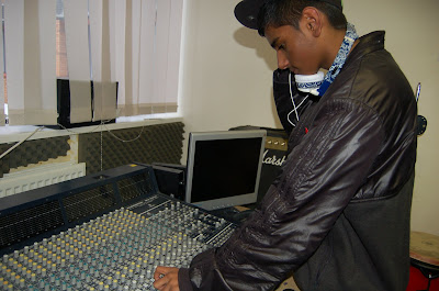
The image above is the image I took for the front cover of my magazine. Clearly, the background of the image does not look very professional and looks like it has been taken in an office. However, taking all of this into consideration, I decided to edit the image using Adobe Photoshop. This programme allowed me to make it look much more professional and increase the quality of the image. The image below is the edited version of the original.


Edited Image


As you can see, it now looks much more professional and it looks like my model is in a party with lighting. Firstly, I applied the "Zoom" effect on the background of this image using Adobe Photoshop, I then used the "Channel Mixer" tool to get "Neon" type colours to replace the colours from the original image. I made the background blue and black as I felt that it made a nice flow between colours, as you can see, the colour of my models headphones match the colour of the background, resulting in a consistent look and feel to the image.

Thursday 25 November 2010

Product Mock-ups

To plan my media products carefully, I had to make sure that I created "Mock-ups" for the products. By doing this, I had a clear view on how I will set out each page, including; the front cover, the contents page and the double page spread. This helped me a great amount as I had a good idea of how all of my products would look by the end of the project. The images below are the mock-ups for each product:

Front Cover


Contents Page


Double Page Spread


Wednesday 24 November 2010

Double Page Spread Research


For my double Page Spread, I am planning to do the same type of layout as this page, which is taken from the magazine, "Guitarist". I was interested by this as it appears to have a great amount of of content and a large picture on the left hand side.

However, when actually making my double page spread, I plan to change the layout and make it slightly different from this as I feel my article should have a smaller image and an increased amount of content with the use of more columns. I also plan to reduce the number of images to one in the real double page spread which I create, but will keep the pull quotes as these make it look like a real double page spread and follow the real conventions of it.